MKSD Participates in “Chair-ity” Event
When Corporate Environments asked Alicia if MKSD would participate in their fundraiser for Valley Youth House, she naturally said. “of…
Read More >Written by Jessica Klocek, RA, LEED AP BC+D, Director of Healthcare Design at MKSD architects.
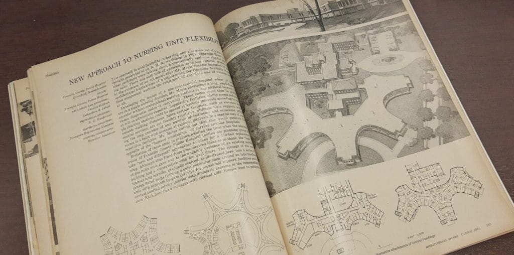
We have all spent the last year, cleaning out those boxes and shelves deep in our basements. In my basement I found an interesting building type study on hospitals while going through a stack of 65-year-old Architectural Record Magazines. The October 1964 magazine focused on several newly designed/built hospitals that incorporated “state of the art” design features. What surprised me is that many recent trends in hospital design include these same features. Are we circling back to the past, or are we finally catching up to the fact we have been doing this all along?
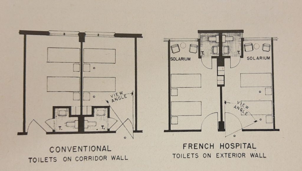
One of the studies focused on the nursing unit concept and how simple changes to the locations of patient room toilets from the corridor to the exterior wall of the building, could greatly increase the nurses viewing angle into a patient room. It’s a layout I recently encountered on a renovation project MKSD completed to a hospital from the 60s that has six floors of patient rooms, all with this configuration. It’s also a layout that some in the healthcare market are revisiting in recent years to tie into decentralized nurses’ stations, allowing the nurses to have a better visual from the hallway since the toilet room is no longer limiting the view.

Another study looked at the organization of the nursing unit and the ability of the unit to work together with a neighboring unit depending on the number of admissions. The nurse station was envisioned as a moveable node which allowed them to shift central to any number of beds that could be occupied at any single time. The support spaces could then be decentralized to allow for equal distribution throughout the unit. After just working on a large emergency department expansion project that utilized these exact principles, I wondered why we ever left this idea of flexibility behind? Was it something that proved less patient friendly? Or was it too difficult a concept to appropriately staff and support internally for the hospital?

Many times, we disregard outdated buildings for their intended usefulness or brilliance. Healthcare designers may have missed the mark with that avocado green wall tile, but the sensitivity to a nurses’ view of their patient or the ease of staff movement was right on. As architects we research, revisiting ideas for their thoughtfulness and ingenuity, while doing our best to improve on them for our clients and time. Like any good design fad things have a way of becoming new again, even in healthcare!
When Corporate Environments asked Alicia if MKSD would participate in their fundraiser for Valley Youth House, she naturally said. “of…
Read More >By Megan Henry, Associate AIA, Project Designer, MKSD architects COVID-19 has caused many changes in our personal and professional lives…
Read More >It’s time for another installment of Chris’ History Corner. Enjoy! Chris Worton, RA is MKSD’s resident architectural history guru and…
Read More >